6 Ways to make your Courses Accessibility Compliant (508/WCAG/ADA) in Storyline
Try this: Open one of your courses, close your eyes, and complete the course without looking. You will likely have difficulty getting off the first screen. If you have vision disabilities, this might be the norm for you. Some in your audience may have color blindness, hearing disabilities, and mobility disabilities, to name a few.
We strive for intuitive eLearning experiences where our audience can focus on the materials, not the container or the navigation. But when we don’t consider accessibility, we are shutting the door on those who have disabilities and challenging our stakeholders to attain alternative training methods for those who need them. You may think that it is rare that someone with a disability would be using your course, but in the United States alone, 6.4 million people have a visual disability, 10.5 million have a hearing disability, and 14.8 million have a cognitive disability (Erickson).
You may have come across these three standards, 508, WCAG, and ADA, but don’t know how they apply to your project. These standards all have the same goal, which is to make our digital solutions accessible for those with disabilities. If followed, the standards set up requirements that greatly increase the accessibility of your course. They all have similarities and you can find additional information about them through the reference links below.
There are many tools that can aid someone with disabilities, such as screen readers that read on-screen text, special input devices that let someone press a few select buttons and read braille, and screens that magnify aspects of the screen. Storyline, as well as most other common eLearning development tools, have accessibility capabilities that can be used to make your projects available to those who need them. It is important to know that in Storyline, accessibility is not automatic. It is something you need to plan for, manage, instructionally and visually design for, and test.
Before we dive in, consider downloading a screen reader which will read your screen and provide a deeper understanding of the many issues you need to address in your projects. There are several that are free and integrate with your web browser. By the time we are done here, with your screen reader on, you will be able to shut your eyes and complete your course.
Let’s explore 6 things you can do to make your courses more accessible.
1. Use alt tags
Alt tags, or alternative tags, are little notes you can associate with any visual in your project. These notes are read by screen readers and other accessibility tools. Any important visual should have alt tags.
- Be descriptive. If you couldn’t see the visual, what level of detail do you need to provide?
- Use alt tags to include instructions that don’t typically need to be on-screen or in the voiceover audio. If you have a Next button, for instance, your alt tag could say “Next. Press space bar to move to the next screen.”
- Words and numbers on graphics won’t be read by screen readers, so make sure they are written in alt tags.
Once you add in your alt tags and navigate your course with a screen reader, you will notice plenty of places additional instructions should be added.
2. Order your tabs
In Storyline, press the Tab key in one of your courses. Notice a yellow box appears around one of the visual items. Press Tab again and again. Notice that the yellow box may seem to randomly jump from item to item. Screen readers and other devices will typically use Tab to move from item to item and space bar to select an item. So random tab orders and unnecessary tabs will cause confusion and frustration. Storyline automatically has tab stops on all of your objects, including slider bars, Next/Prev buttons, and other input components.
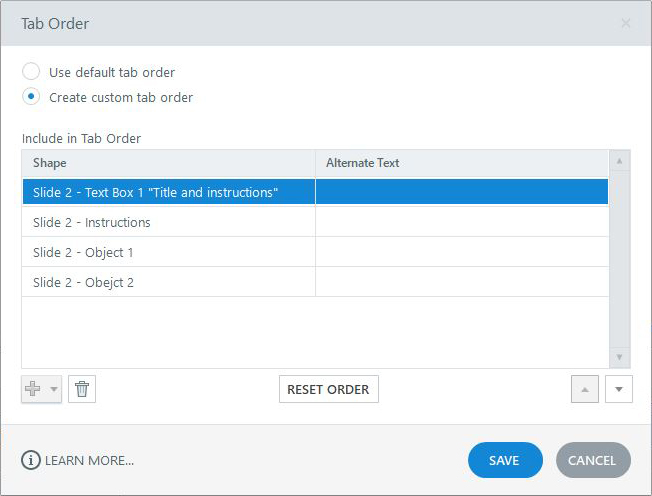
- In Storyline, click on Home, then Tab Order
- Remove unneeded objects. You can also do this by right-clicking an object, clicking Accessibility, and unchecking “Object is visible to accessibility tools”
- Set the Tab Order box to “Create custom tab order” and drag the tabs into the order you want that yellow box to show up when you press tab.

3. Use alternative content
When you develop with accessibility in mind, you may have to remove drag and drops and other mouse directed interactions. You will have to make decisions on what might or might not make accessibility more difficult. In some cases, the best approach to learning is to keep in these more complex interactions. If this is the case, you can create alternative interactions on different slides that are accessible. We worked on a project that had a drag and drop to order conversations between two roles. We created a separate version of this interaction on another slide and made sure the user could tab through each conversation, hear descriptions of each conversation, press tab to select the correct conversation, space bar to select it, and continue until they selected each in the correct order. How did Storyline know to use the alternative slide? On the very first screen of the project, when the user tabbed to the Next button and pressed Spacebar to continue, we changed a variable called “AccessabilityUse” to true. Then we showed any alternative slide as they moved through the project.
4. Writing for accessibility
We discussed writing instructions in alt tags, but there is far more to consider when writing for accessibility.
- Don’t get too wordy. Keep it straightforward and simple.
- On-screen visuals and charts should have alt tags or caption descriptions. If you show a chart on-screen and your voiceover narration says, “As you see from this chart…” Instead, describe the chart enough so that someone who can’t see it, can understand it.
- Don’t forget to include instructions in on-screen text. If your learner has problems hearing your audio narration, they may not hear how they should be interacting with your course.
5. Use closed captions
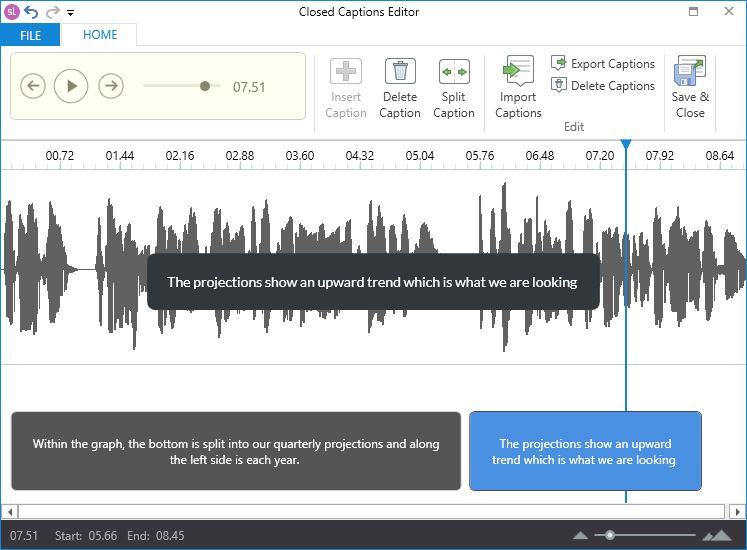
Storyline 3 and 360 have a powerful closed captions system. Being able to see the audio text on the screen is helpful to those who have hearing disabilities, and the same text will be read if the user has vision disabilities. In Storyline, anything containing audio has a captions button, including audio and video. In the captions screen, it is easy to time the on-screen text with the audio. You can also import caption files if they are available to you.

6. Designing for accessibility
Remember that accessibility isn’t just about making adjustments in Storyline, it is about instructionally and visually designing a project with an accessible experience. Some key points to keep in mind:
- Keep the navigation linear and simple. We don’t want someone to get lost and miss important information.
- Keep text large on the screen and don’t get too wordy.
- Make sure graphics don’t conflict with text. We want a high contrast between the two. Sometimes background images can muddy the page and make it hard to read.
- Taylor your educational approach to present information, activities, and knowledge checks so they are easy to use without complicated interactions.
Wrap Up
We have barely skimmed the surface of accessibility. Discuss accessibility with your stakeholders to understand the level you need in your courses. There are many comprehensive ways to access the accessibility needs of an audience and a course, and many who can help with course audits as well.
You can learn more by visiting the following links:
Erickson, W., Lee, C., & von Schrader, S. (2012). 2010 Disability Status Report: United States. Ithaca, NY: Cornell University Employment and Disability Institute(EDI).
Schedule an intro and demo with Illumen today
We are always happy to discuss the following with you:
- Project and performance needs
- Securing a quote
- Planning your RFPs
- Brainstorm project ideas
- How to leverage the latest technology and instructional training methods
You can also call us anytime at 847-440-2222!
